Color Points on a Graph by Attribute Values
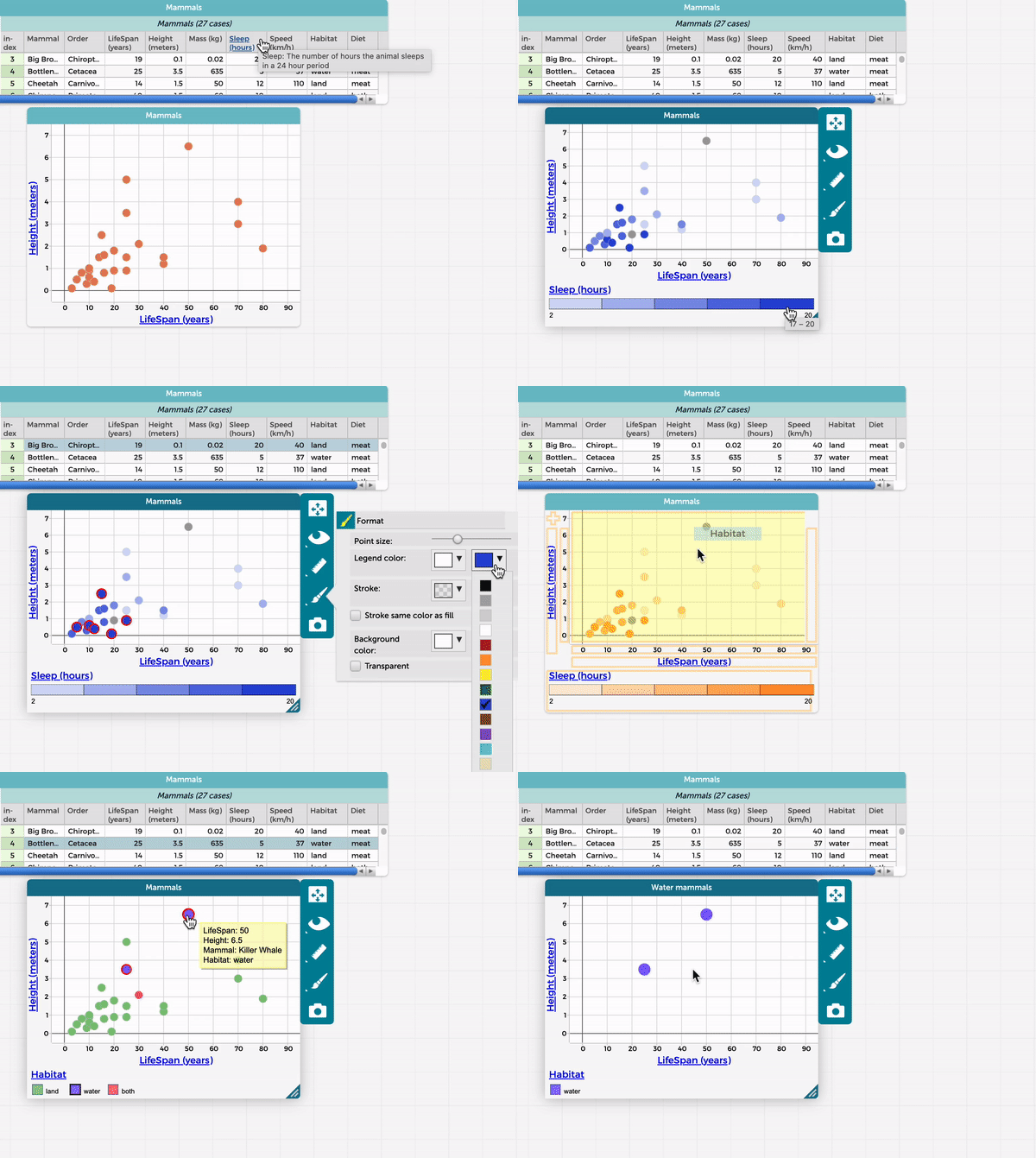
You can color points on a graph by the values of an attribute. This is typically done with attributes of categorical or numeric data type, but it is also possible to do this with date, qualitative, or checkbox attributes. First you will need both the Table and Graph windows open. The graph must have an attribute added to either one or both axes. Then, follow these steps (see also the clip below):
- Click and drag any attribute name from the top of any column in the Table to the center of the Graph, as shown in the clip below.
- When the graph region turns yellow, release the mouse.

Additional points to note:
- The graph dynamically updates to show colored data points keyed to a color-coded legend that appears at the bottom of the graph window.
- For numerical values, the darker the color, the higher the value of that legend attribute. CODAP shows five different colors in the legend for a numerical attribute and divides cases into 5 bins with an equal number of cases in each bin (e.g., if there were 20 mammals in the dataset, and the numerical attribute used for the layer in color/legend were how long the mammals slept, the 4 mammals with the shortest sleep durations would correspond to the leftmost color on the legend). Read more on how these bins are created in this FAQ.
- For categorical values, each category will be assigned to a different color, specified in the legend.
- It is possible to change the colors, as shown in the first half of the clip above.
- If you place the cursor over (without clicking) a data point in the graph, it will display the values for that point (including the added attribute in color).
- If you click on a color in the legend, the points in the graph corresponding to that color will be highlighted. This feature can also be used to filter the graph on particular values of an attribute (only show certain values/hide other values), as show in the second half of the clip above (to only show cases that are mammals that live in water). To select multiple colors in the legend, hold down the Shift key while selecting.
- It is also possible to split a graph by values of a categorical attribute.