Forum Replies Created
-
AuthorPosts
-
 Bill FinzerKeymaster
Hi Jon,
There is now a beta release of CODAP V3 that you can learn about here. You can launch the beta release with this link. If you try it on your own and/or with your students we would very much appreciate learning of any problems you experience so we can fix them before the final release.
Thanks for hanging in with us,
Bill
Bill FinzerKeymasterI’m assuming that by “line graph” you mean a scatterplot with the points connected by a line. The mechanics of creating the graph are pretty simple.
- Click the Graph icon in the tool shelf to make a graph.
- Drag a numeric attribute to each graph axis to create a scatterplot.
- Click the Ruler menu on the right side of the graph and choose “Connecting Lines.”
But your question suggests deeper concerns about making the graph easy to read and, perhaps, selecting data that lends itself to interpretation with line graphs. Perhaps you could say a bit more about what those concerns are?
Bill
November 6, 2025 at 5:36 pm in reply to: Graph not binning correctly for just one numerical variable #13727Bill FinzerKeymasterHello again,
My colleague Dan Damelin pointed out that at least one point is still in the wrong bin after fixing the alignment. So, more investigation is needed. We’ll keep you posted.
Bill
November 6, 2025 at 5:08 pm in reply to: Graph not binning correctly for just one numerical variable #13726Bill FinzerKeymasterHello Terri,
I must admit you had me stumped for a while, convinced that you’d uncovered a serious bug! I stumbled on the cause of the problem when I wondered what would happen if I changed the “alignment.” When I went to edit it, I discovered a lot of trailing zeroes and, when I cursored out far enough through them, a non-zero trailing digit. Getting rid of that brought the points into the bins you would expect them to be.
It’s still a bug, of course, that the alignment is chosen as it is. I’ll report that and we’ll get it fixed, if not in the current version, at least in the new version to be released early next year.
Thank you very much for discovering and reporting this problem.
Bill
Bill FinzerKeymasterHello Fai,
Try the expression “< 4” for the top branch and “*” for the bottom branch as shown in the enclosed screenshot.
Bill
Attachments:
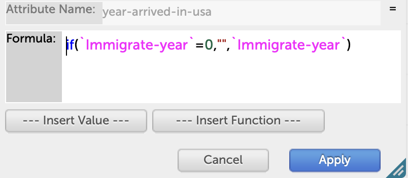
Bill FinzerKeymasterHi Traci,
I just tried your proposed solution and it worked for me. I’ve enclosed a screenshot of the formula editor so you can compare. The quotes are very tricky as I’m sure you know. The attribute names require back-tic quotes so that the hyphen is not interpreted as a minus sign. And I would suggest that you use an empty string with no space as the empty value.
It’s disturbing that you were able to crash CODAP. Can you email me a document that does that so we can track down the problem?
Thanks, Bill
Attachments:
Bill FinzerKeymasterThanks for this question. One way for CODAP to resolve this problem would be for box plots to respond to Show Measure Labels and show all the box plot values in label.
Bill FinzerKeymasterHello Laura,
Unfortunately CODAP only allows one attribute on the right side y-axis.
Bill
Bill FinzerKeymasterAh. Yes, there is. Here is a shared document that demonstrates a technique that might work for you. Basically, we define an attribute in the source that attempts to look up cases in the sample collection and returns true if found and false if not found. It’s a little tricky. Let me know if it works for your situation?
Bill
Bill FinzerKeymasterHello Taryn,
I don’t fully understand the question. Is this using the Collector device in the Sampler? If so, you could add an attribute to the source dataset that uniquely identified each case. This would let you see which ones got sampled. But I’m not sure what is meant by “compare them to the full dataset.”
Bill
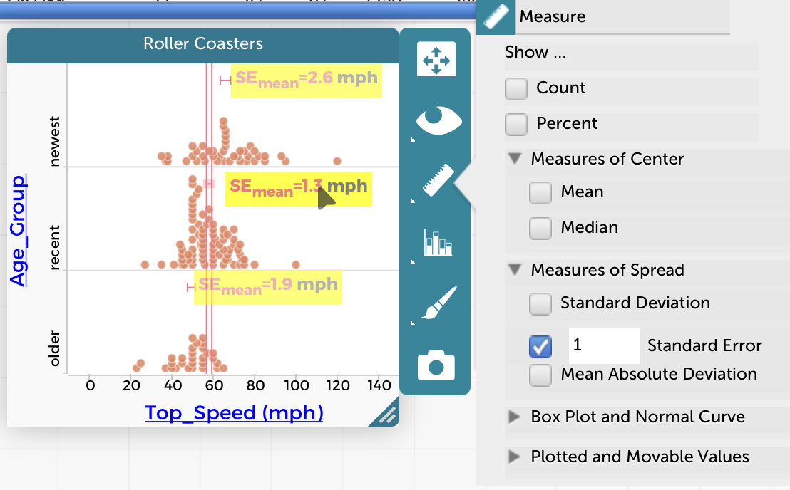
Bill FinzerKeymasterHi again,
Just in case you aren’t already aware of the ability to show standard errors, check out the enclosed screen capture. Note that hovering over one of the error bars or its label causes lines to extend that make it easy to check for intersections with other error bars.
I know this doesn’t take the place of error bars associated with a bar chart. But maybe it’s better?
Bill
Attachments:
Bill FinzerKeymasterSorry, you’re right. There’s no way to add error bars.
Bill FinzerKeymasterHi Claire,
Ah, don’t put the numeric attribute on the y-axis. With the categorical attribute on the x-axis, choose Fuse dots into bars from the Configuration menu. Then, from that same menu, you’ll see the option to set the scale using a formula.
I just found the relevant page in the help system. I bet that will help! 😉
Bill
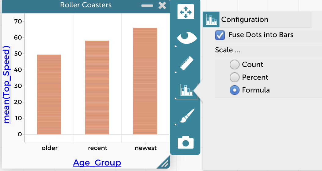
Bill FinzerKeymasterHi Claire,
It is possible to do. Once you’ve made a bar chart, go to the configuration menu as shown in the screen shot and choose Formula for the Scale. Then you can enter the formula you want and the bars’ heights will be equal to the result of evaluating that formula for each group of cases.
Hope that helps,
Bill
Attachments:
Bill FinzerKeymasterI haven’t heard of anyone else experiencing that problem. I’m sorry it’s happening to you.
Bill
-
AuthorPosts