Show Box Plots in CODAP
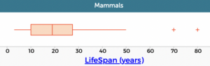
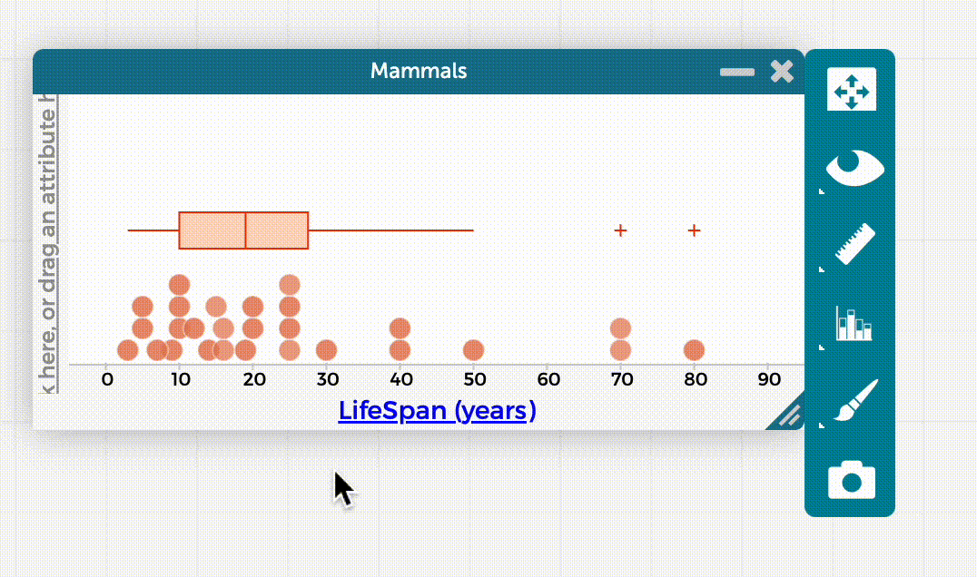
In a box plot, a box extends from the 25th to the 75th percentile and is cut by a line at the median. “Whiskers” extend out from each end of the box, either 1.5 times the interquartile range or to the end of the data, whichever comes first.
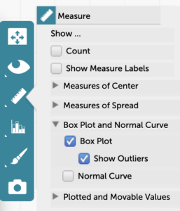
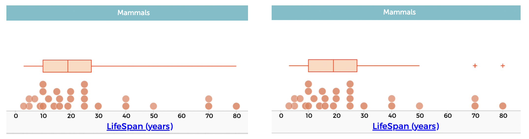
To create a box plot, put a numeric attribute on an axis, click on the ruler icon in the inspector palette to the right of the graph, click the triangle to expand the options for “Box Plot and Normal Curve” (if not already expanded), and select “Box Plot.” To see the outliers as separate points (plus signs), check “Show Outliers.” The box plot below on the left has the upper outliers included as part of the whisker–the one on the right shows them as separate points.
Note that you can click on the left or right side of the box, on a whisker, or on a plus sign for an outlier to select/highlight the corresponding points, as seen in the image below, where all the points between Q1 and Q2 (the median) are selected/highlighted. You can also mouse over the start of each quartile in the box or over the whiskers or the plus signs for the outliers to see their exact values, as shown in the GIF below.
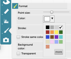
To hide the data points and see only the box plot, click on the Paintbrush icon in the inspector palette to the right of the graph. Make the data points white in color, or drag the slider for “Point size” all the way to the left. Note that you can also change the point size or color to make it easier to see the box plot with the points on it.