Show Connecting Lines
- Select the graph by clicking on it. The inspector palette will appear to the right of the graph:

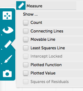
- Click on the measure/ruler icon:
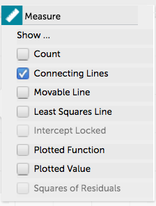
- Select Connecting Lines in the “Measure” panel that appears. All points from the same attribute will be connected with a different colored line. You can see how to view only certain attributes on a graph here.
- Here is a view of a graph with Connecting Lines:
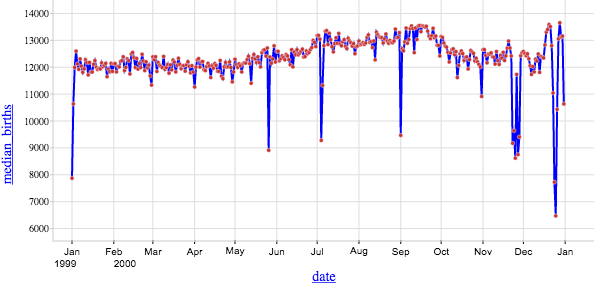
Note: If you are adding a connecting line to time-series data, make sure the data are sorted by date in the table before adding a connecting line in the graph.