- This topic has 6 replies, 3 voices, and was last updated 2 months, 1 week ago by
 Lee Creighton.
-
AuthorPosts
-
Lee CreightonParticipant
Back when I worked for JMP, I created a demonstration to illustrate what a confidence interval means. I’ll attach a screenshot and you’ll get the idea of what I want to do. I repeatedly (100 times) from a population data table and create means and confidence intervals for each sample. Since I created the population, I know its mean, and I can color the confidence interval as gray (captured the true mean) vs red (I didn’t). This idea is certainly not original with me.
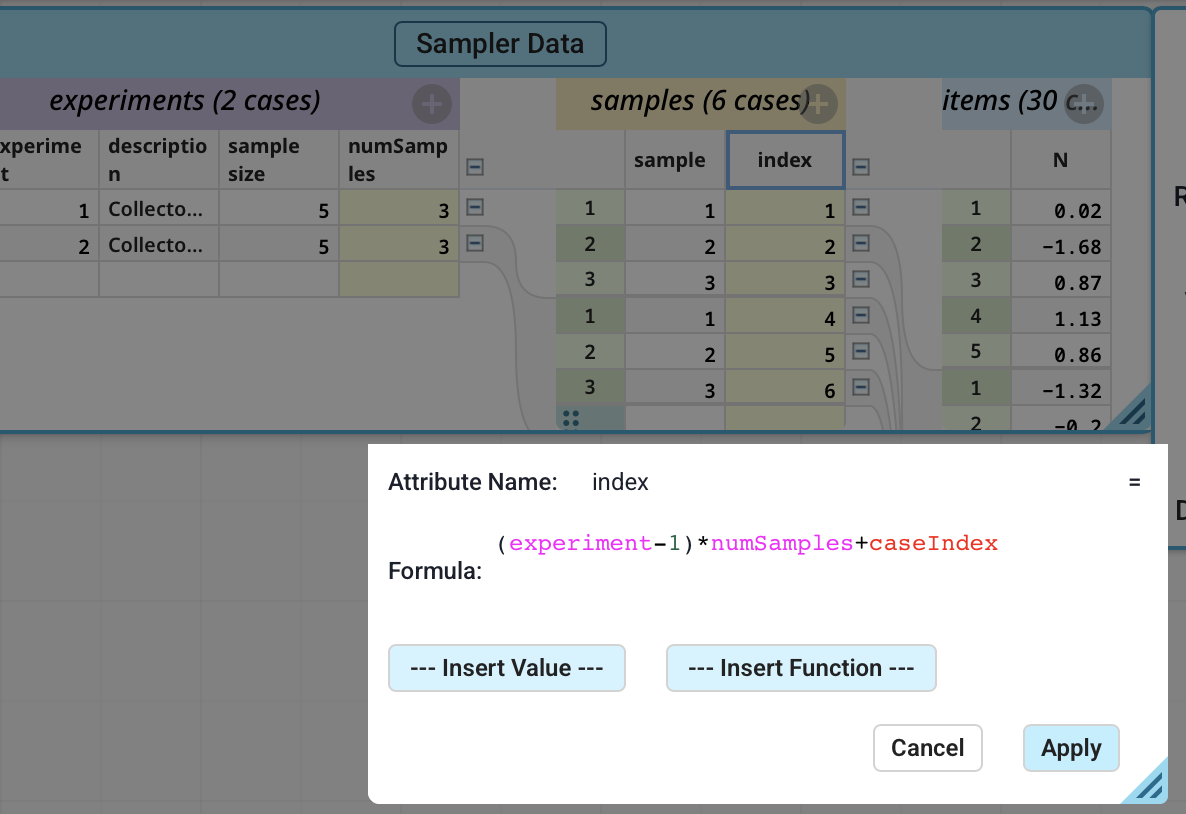
So I set up a data table with 1000 normal variates and use the sampler to repeatedly collect samples. In the middle Sampler table (labeled Samples in my attachment), I’d need a count from 1 to 100 so that I can make the plot. However, the CaseIndex function has let me down a bit. I sort of expected it to return the row number of the table, thus generating the numbers I need. However, it (quite logically) returns the case number as labeled in the table, so I get 1 2 3 1 2 3 for the first two samples.
I thought maybe I could get the caseIndex from the Experiments table and combine them somehow to generate the number I need, which is why you see a CaseIndex2 variable. I’m not able to puzzle it out. So my question:
Is there a way to count rows in the Samples data table?
A future question will be whether I can specify the colors of the lines like I did in JMP. I don’t see a way to do that either, which I suppose means this should be a plugin rather than something I build from existing tools. The existing tools are so good, though! I want to use them!
March 1, 2026 at 4:36 pm #15674 Bill FinzerKeymaster
Hi Lee,
Nice challenge! And it led me to find a serious bug in the current V3 beta when I tried to make a new dataset with 1000 cases. ☹️
But I was able to solve the indexing problem, as shown in the attached screenshot. (It’s not completely general in that it falls apart if the number of samples in each experiment is not constant.)
I don’t have time to try it, but I suspect that you can also color the bars using a legend to detect when they do not encompass the true mean.
Thanks for working with us!
Bill
Attachments:
March 2, 2026 at 3:13 pm #15685 Dan DamelinKeymaster
Lee, can you send a share link to the doc you are working with containing a full set of samples you would like to use for a demonstration?
March 9, 2026 at 7:04 pm #15767Lee CreightonParticipantSorry for the long response, Dan. I’m not getting email updates to responses from this thread, so I missed your request.
Have a look at <span style=”caret-color: #000000; color: #000000; font-family: Montserrat, sans-serif; font-size: 12px; white-space: pre; background-color: #eeeeee;”>https://codap.concord.org/app/static/dg/en/cert/index.html#shared=https%3A%2F%2Fcfm-shared.concord.org%2Fes4CRiXp2DySgO4nc8T4%2Ffile.json</span>
March 9, 2026 at 7:04 pm #15768Lee CreightonParticipantAlso, the .codap file itself:
March 9, 2026 at 7:11 pm #15770Dan DamelinKeymasterDoes this give you the result you where hoping for?
The only thing I might suggest is that you can adjust point size and legend colors using the formatting pallette (the paintbrush tool). Is this version any better?
March 11, 2026 at 6:05 pm #15775Lee CreightonParticipantI certainly like your colors better! And apparently attaching the .codap file as an attachment isn’t a good idea on the forum—noted.
-
AuthorPosts


- You must be logged in to reply to this topic.