Forum Replies Created
-
AuthorPosts
-
 Jacob SagransParticipant
Ah that makes sense, thanks!
Jacob SagransParticipantThank you Bill! A somewhat related question I am now wondering about is how numeric data displays in the table/on the graph. It seems if you specify numeric, commas will be added to the numbers at 10,000 and above in the table and on the graph, but there would be no easy way to have a number below 10,000 display as, say “5,000”–is that correct? Thanks again.
March 14, 2023 at 11:03 pm in reply to: Unable to manually change color for categorical variable on a map #7506Jacob SagransParticipantThat fixed my issue! Thanks!
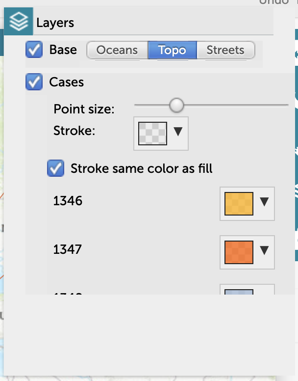
March 14, 2023 at 9:59 pm in reply to: Unable to manually change color for categorical variable on a map #7503Jacob SagransParticipantHm that doesn’t seem to work for me though (see the screenshot below). I tried clearing my cache and two different browsers.
Attachments:
March 14, 2023 at 8:06 pm in reply to: Unable to manually change color for categorical variable on a map #7501Jacob SagransParticipantI tried two different browsers and it did the same thing in both.
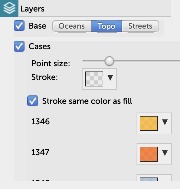
March 14, 2023 at 7:56 pm in reply to: Unable to manually change color for categorical variable on a map #7499Jacob SagransParticipantHere’s the image:
Attachments:
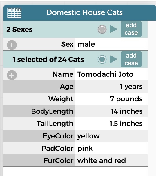
Jacob SagransParticipantBasically, I wonder if it could look like this but with a photo added.
Attachments:
Jacob SagransParticipantNice, thanks!
Jacob SagransParticipantNice, so if the video is in some place other than Google Drive or YouTube, it can work?
Jacob SagransParticipantHas anyone subsequently figured out a work around for this? Would really be nice to be able to embed a video in CODAP.
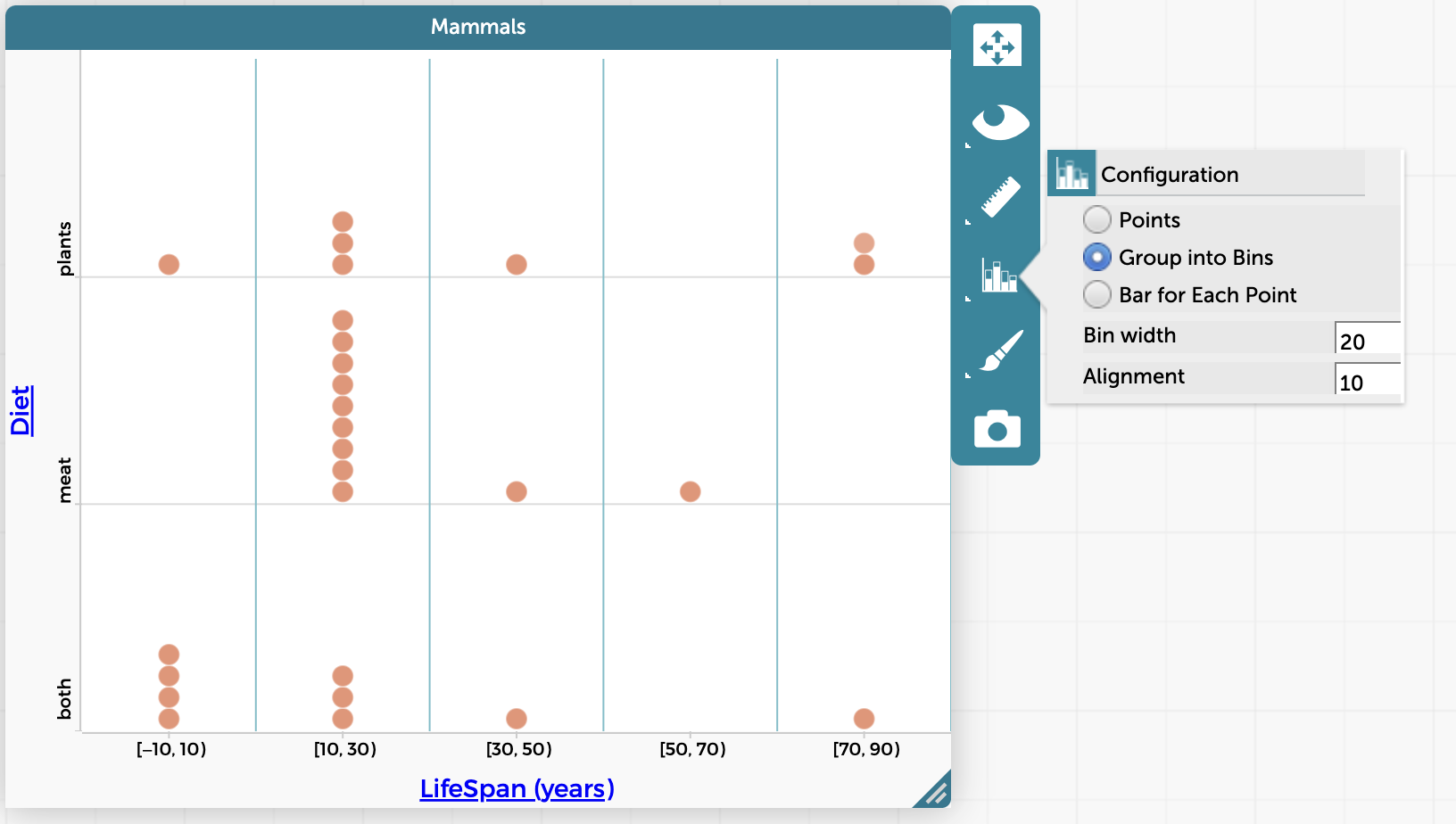
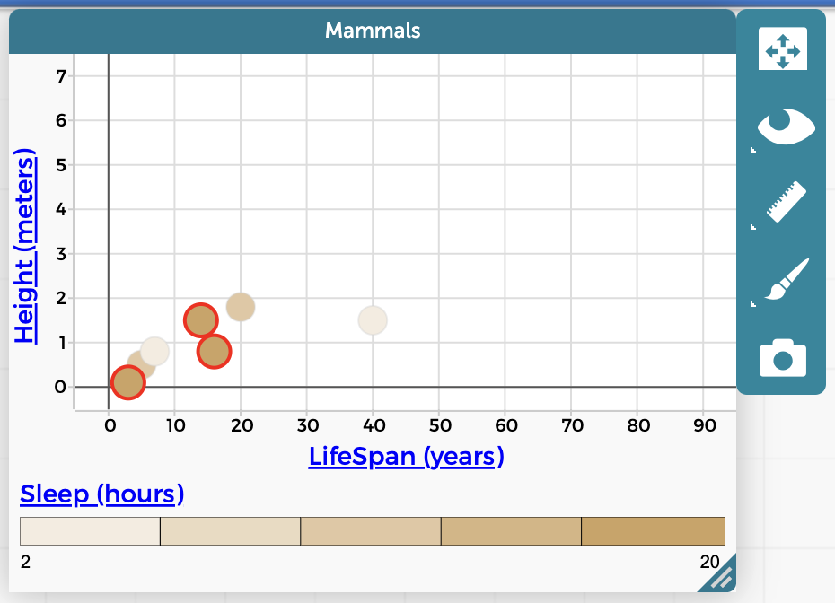
Jacob SagransParticipantJacob SagransParticipantIf you don’t set the alignment parameter, is the default always to start the first bin at 0, even if there are negative values in the data? Also, I tried changing the alignment for bins for mammals’ lifespan from 0 to 10, and it gave me a bin of [-10, 10), even though there are of course no negative values for this attribute. I guess that makes sense in a certain way (having equal bins for -10 to 10, 10 to 30, 30 to 50, etc.), but is also a bit weird.
December 15, 2022 at 3:57 pm in reply to: Problem with scale ranges for coloring points on a graph by numerical attribute #7336Jacob SagransParticipantTurns out there is a lot pertaining to the color scale already in Pivotal Tracker:
“Quintile selection doesn’t adjust after hiding selected/unselected”: https://www.pivotaltracker.com/story/show/183831874
“Allow choropleth legend to reflect values in entire dataset even when only a subset is being viewed”: https://www.pivotaltracker.com/story/show/182702665
“Two categories can wrongly get assigned to the same legend color”: https://www.pivotaltracker.com/story/show/158934514
And more here: https://www.pivotaltracker.com/n/projects/1055240/search?q=color%20legend
December 15, 2022 at 3:27 pm in reply to: Problem with scale ranges for coloring points on a graph by numerical attribute #7335Jacob SagransParticipantThanks for the reply Bill. Maybe this could be changed/improved for CODAP at some point in the future? I should see if there is something about this in the CODAP Software Pivotal Tracker, and if not, add it.
December 14, 2022 at 7:48 pm in reply to: Problem with scale ranges for coloring points on a graph by numerical attribute #7328Jacob SagransParticipantThis is what it looked like initially after I did the filtering. All the points shown are in the 10 to 12 bin (and are all highlighted if I click on that bin in the bar in the legend). But, as shown below, if I click on the 12 to 17 hour bin, points for 12 hours only are highlighted too.
-
AuthorPosts