Forum Replies Created
-
AuthorPosts
-
 Bill FinzerKeymaster
Ah, that makes it clear. I’m guessing you don’t really need points plotted in each state? If that’s true, then rename latitude and/or longitude to something CODAP won’t recognize as lat/long. I often add an underscore to the end of the name. Then when you drop an attribute on the map you’ll just get a legend for the boundaries.
Hope that helps!
Bill FinzerKeymasterHi Andee,
Though I don’t see an attachment, I’m guessing that your map has two “layers” from the same dataset; e.g. States’ boundaries and cities as points with latitude and longitude. Let’s assume the States are at one level and the cities at the level beneath. Now, you drag a categorical attribute for cities into the map and you get two legends. Ugh!
This is a bug that I fixed yesterday. It will appear in build 0476.
In the meantime you can click on one of the legend attribute names and use the resulting menu to remove that legend. The other legend will remain.
Now if, by chance, both layers are at the same level, then the problem will persist even after the bug fix and there’s some question about what the behavior should be. Similarly, if the legend attribute belongs to the higher level, the problem will also persist, again with more design thinking required.
Thanks so much for posting your question, and I hope this response helps, at least a bit.
Bill
Bill FinzerKeymasterHi Joachim,
It sounds like you’ve already figured out the (few) ways there are to do statistical simulation in CODAP, which remains far behind the capabilities built into Fathom.
Bill
Bill FinzerKeymasterHi Wendy,
CODAP doesn’t have any curve fitting capabilities (beyond linear). Of course it’s possible to fit a curve from a chosen family by setting up a slider to vary, and computing squares of residuals whose sum can be minimized, but this is a lot of work.
Bill
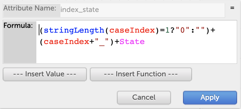
Bill FinzerKeymasterHi Andee,
Regarding the formula workaround, I just thought of a simplification:
(caseIndex+10)+”_”+State
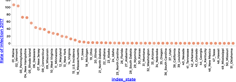
The goal is that the computed value sort alphabetically to the same order as the states appear in the table.
caseIndex is the row number in the table. By adding 10, we avoid the complication that alphameric sorting places “10_” before “2_”. So once the states are sorted in decreasing order of Lyme disease incidence, the values computed by the formula will also sort in that order and that will be the default order in which they appear on a categorical axis.
Confusing? You bet! 🙂
Bill FinzerKeymasterRegarding the connection between case order in the table and order of categories: We regard these two things as conceptually distinct. Suppose, for example that you have census records of people, each with a marital status. We don’t say that the order of the records should determine the order in which ‘married,’ ‘divorced,’ ‘never married,’ etc should appear on a categorical axis. The default order is alphabetical, and the user can change that order manually.
But perhaps this brings up a research question: How do learners regard categorical values, and how do they come to understand the different ways they can be used in data visualization and analysis?
Bill FinzerKeymasterHi Andee,
So you didn’t want to drag the states to the desired order?
I was stuck for quite a while and almost gave up the search for an automated solution. But, as you can see in the screen captures, I was able to create a new attribute whose alphabetic order is in order of decreasing incidence.
So that gives you a “workaround” but it’s hardly a generally useful solution.
One wrinkle is that most of the time a given category (State in this case) has more than one value. So you would have to plot something like a mean to have single-values to order by. Then you could have a command somewhere in the graph interface to Order by Value.
But do we want to add something to the interface to automate a task seldom encountered and that can be done manually?
Bill
Attachments:
Bill FinzerKeymasterHi Joachim,
CODAP determines how to group connected lines by the grouping at the leftmost level of the case table. So you can produce the effect you want by dragging the country attribute to the left in you case table so that it forms a new level.
If the legend attribute is the same as the grouping attribute, then the points and lines will get the same colors.
Bill
Bill FinzerKeymasterHi Colin,
Many web sited, including google and youtube do not allow themselves to be embedded in an iFrame. Try https://en.wikipedia.org/wiki/Cats_(musical)or concord.org to see that some URLs work.BillBill FinzerKeymasterHi Kurt,
Unfortunately there is no good way to print directly from CODAP.
For graphs (and maps), you can use the Camera icon menu and export an image of the graph.
For tables you can use screen capture software.
Sorry I don’t have a better solution for you.
Bill
Bill FinzerKeymasterHi Kurt,
There is a good way to do this in CODAP.
- From the Table icon menu choose –new–.
- Rename the AttributeName attribute (using Attribute Properties) to something meaningful, like IQ.
- Click on the green rectangle in the first row and choose Insert Cases….
- Enter the desired number of cases you want; e.g. 1000 and press the Insert Cases button.
- Click on the attribute name and choose Edit Formula….
- Enter the formula
randomNormal(100,10)
That should do it!
BTW, I think you had to leave the webinar before the very end when I did a demo of this very thing! But with sliders!
Bill
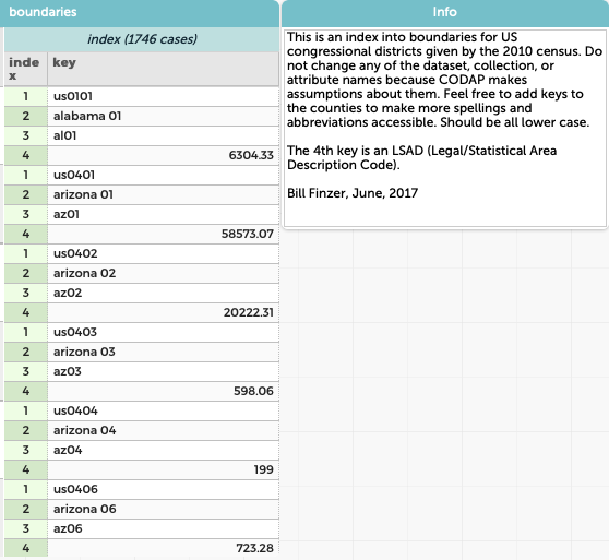
Bill FinzerKeymasterHi Sonny,
My bad. I was thinking of census tracts, which we haven’t provided. Thanks for getting back to me!
So here is a link to an example using congressional districts. And the enclosed screenshot shows the 4 ways that congressional districts can be keyed.
We haven’t updated the congressional districts for the remapping in Pennsylvania. But we should. I’ll add it to our list!
Bill
Attachments:
Bill FinzerKeymasterHello Sonny,
We haven’t provided congressional district boundaries. But we could if you or someone else had a need for them. What are you wanting to do?
Bill
Bill FinzerKeymasterHello Dany,
We do not have the Italian boundaries in our database. It would not be very difficult to create. If you or someone you work with were willing to do part of the work, we could add them.
BTW, I notice from Google Analytics that there is a lot of CODAP activity in Italy recently. Do you happen to know anything about that?
Bill
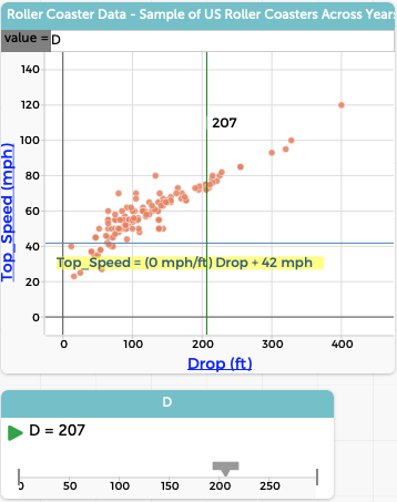
Bill FinzerKeymasterHi Andee,
I was disappointed to find that the movable line disappears when it is exactly vertical. Darn. I’ll log that as a bug. BTW a horizontal movable line works fine.
For a vertical line you can use a Slider and Plot Value. Your formula for the plotted value will simply be the name of the slider. Then you can drag the slider to change the position of the vertical line. Not as nice as direct manipulation, of course.
I’ve included a screen shot that shows both a vertical line with position determined by a slider, and a horizontal movable line that you can grab and move directly.
Bill
Attachments:
-
AuthorPosts