Forum Replies Created
-
AuthorPosts
-
 Bill FinzerKeymaster
Good catch Andee!
Rick Hudson (of ESTEEM) beat you to the punch and, I’m happy to report, we have a fix in the works for the next release.
I’m glad you like the bins. They are brought to you by Victor Lee at Stanford.
Bill
Bill FinzerKeymasterHello Steen,
I apologize for somehow missing your initial post. The data game Shuffleboard relied on communication between the game and CODAP that is no longer in effect, but we didn’t realize that it was broken.
The game can be modified to work again. Meanwhile we’ll remove the game from the list at CODAP data interactives. Is that the site from which you were launching it? (There is another, older site that also lists it.)
Shuffleboard never supported save and restore because it was designed for quite short interactions. That, too, could be remedied.
Yours,
Bill Finzer
Bill FinzerKeymasterThanks for this bug report! I apologize for the delay in responding. The help forum software wrongly marked your post as spam.
Good news: the bug is fixed. The dates now display correctly in the case table.
Bill
Bill FinzerKeymasterThanks for the bug report! And I apologize for any delay in response. The help forum software is wrongly marking some posts as spam. 🙁
The good news is that this bug has been fixed. 🙂
Bill
Bill FinzerKeymasterThanks for this bug report! Working on it …
Bill FinzerKeymasterHello!
Thank you so much for this bug report. I apologize for what must be a delayed response as your post got marked as spam for some reason.
I’ve just entered your post into our bug tracking system and marked it as high priority to fix.
Bill
Bill FinzerKeymasterHello Robert,
Glad you appreciate CODAP’s design. We really try hard to make it simple to use.
The functionality you need is, unfortunately and with a couple exceptions, not present in CODAP.
- In a scatterplot you can plot a least squares regression line and r-squared is reported along with the equation of the line.
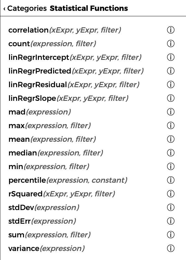
- There are a set of statistical functions shown in the enclosed screenshot. A good example of using the correlation function is described here.
CODAP is constantly evolving through collaborations with other funded projects, which have been mostly science education projects. No project has yet had the aim of developing materials that fully support introductory statistics with a full complement of tests and estimates.
Plugins, like the Sampler used in the (new) Duck Pond example document, provide a fairly straightforward way to extend CODAP’s capabilities. You, or someone you know with a modicum of programming chops, could create a CODAP plugin that would do the computations you desire within CODAP. Alternatively, consider writing a proposal to the NSF or some other funding agency, and we’ll collaborate!
Bill
Attachments:
Bill FinzerKeymasterHi Joachim,
Definitely not a silly question as being able to drag points is important in CODAP.
I’m confused. Your first paragraph implies that you are able to move a data point, right? If you have the mean and median displayed, you should be seeing them change while you are dragging the point. When you release the point it will slide back to its original place.
Your second paragraph implies that you are not able to drag a data point. Here are the conditions under which that would be true:
- The point’s position is defined solely be categorical values.
- The point’s values are computed from a formula.
If this remains unclear, perhaps you could share a document?
Bill
April 19, 2020 at 6:17 pm in reply to: Difference in graph when variable is numeric or categorical #1461Bill FinzerKeymasterHi Andee,
When the x-axis is numeric, the x-coordinate of the plotted point will be exactly its value above the axis. So if month is 4, the point will lie above the 4. If two points have the same value for month they may overlap if their y-values are close.
When the x-axis is categorical, each category gets a bit of space for its points and the points get stacked (horizontally in this case) as needed within that space. So two points with the same month and rainfall will be offset from each other horizontally.
I hope that explains the difference!
Bill
Bill FinzerKeymasterYes, you’ve encountered a recently introduced bug. 😞 Fortunately, it is fixed in the next release which, if it passes QA, will come out by end of day April 17.
Thanks for reporting it, and sorry for the inconvenience.
Bill
Bill FinzerKeymasterI agree that it might improve quality of life, at least for some. It could be a dialog box that says something like “Open with auto save enabled?” The downside would be that causes the user to have to make a (possibly ill-understood) decision before they get to their document.
But it’s a good suggestion and I’ll add it to our list of feature requests. Thank you!
I’m very glad you see CODAP as a “wonderful tool.”
Bill
Bill FinzerKeymasterThank you so much for bringing this to our attention. This seems to be a bug that has crept in rather recently. I’ll put it at the top of the list!
Bill
Bill FinzerKeymasterHello Barak,
Sad to say, CODAP does not (yet) support error bars.
Bill
Bill FinzerKeymasterHi Kathy,
Thanks for this question. It comes up fairly often.
John Tukey, father of exploratory data analysis, invented box plots in 1970, long before computers with graphical user interfaces were available, let alone commonplace. Datasets were often small enough to be dealt with by hand. Tukey wanted graphical representations that could easily be created and understood with just paper and pencil. Thus his method for constructing a box plot didn’t require any computation, facilitated by the “removal” of the median value in a distribution when finding the “Q2 or Q4” values as the median of what remains.
But you probably knew all that! 😉
Tukey’s method comes up with an approximation to the 25th or 75th percentile of the distribution. CODAP (and Fathom) instead calculate the actual 25th or 75th percentile for their box plots. (See Wikipedia for computational methods.) This seems appropriate in an age when doing things by hand is rarely called for. And, of course, with any reasonably sized dataset, the two methods yield nearly, if not exactly, the same result.
As an aside, I don’t find box plots useful for characterizing a single distribution. They come into their own when comparing two or, especially, many distributions.
Bill
Bill FinzerKeymasterAh, you have identified a previously unknown bug!Kudos!
I’ll log it an get it on a fast track to be fixed.
-
AuthorPosts